
Repositioning a Flagship Brand
After several years of market confusion (but plenty of equity) it was time to elevate the B2B i-Ready portfolio from a house of brands to a branded house.
ROLE
Creative Direction, Strategy, Graphic Design, Advertising
TIMELINE
18 months
i-Ready was introduced to the market as a digital assessment for grades K-8 in 2008, but now offers educational tools across multiple individual product brands. Transitioning this audience relationship from a well-known SaaS product to that of a robust portfolio (with lesser-known sub brands) was a unique, ever-evolving challenge.
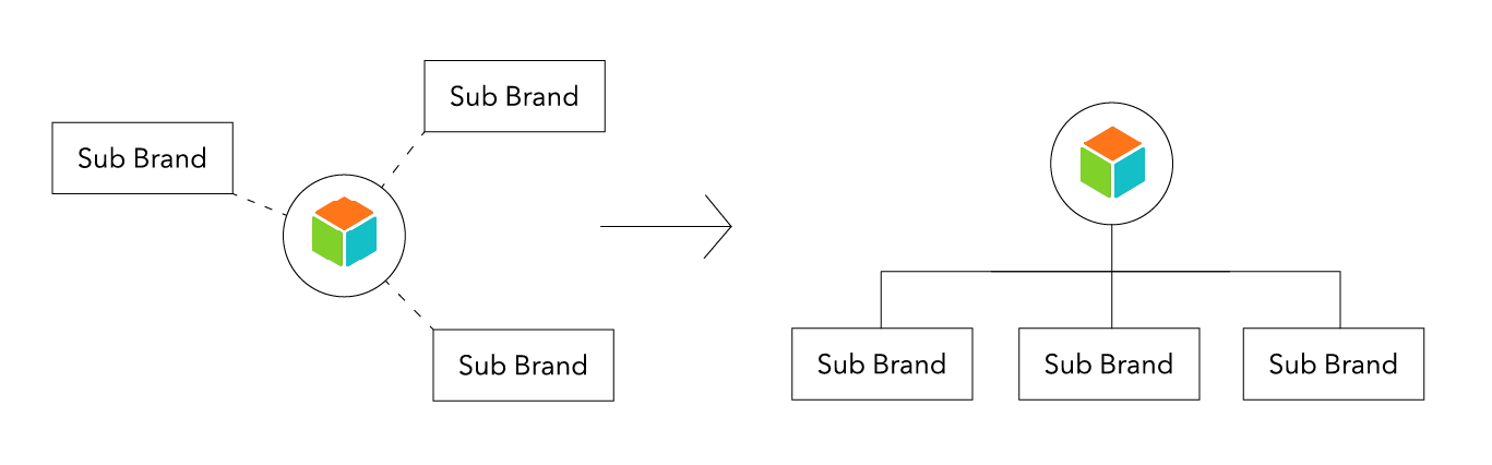

We started at the portfolio level.
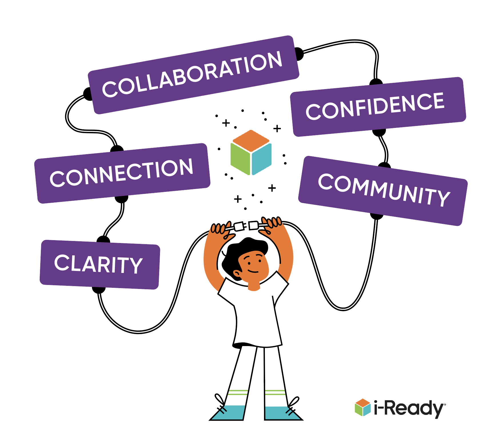
At the core of our identity is the i-Ready cube; a recognizable element within the education space that holds a great deal of brand equity. We took the cube and broke it apart to envision it in new ways to allow both flexibility and cohesion.
We were able to pull out a singular shape—a simple triangle—and use it to create both a bold pattern and a subtle grey grid used for the alignment of elements.


The pattern was used to create breakaway ‘tessellations’—a nod to digital pixels and the connection of products to the digital assessment.
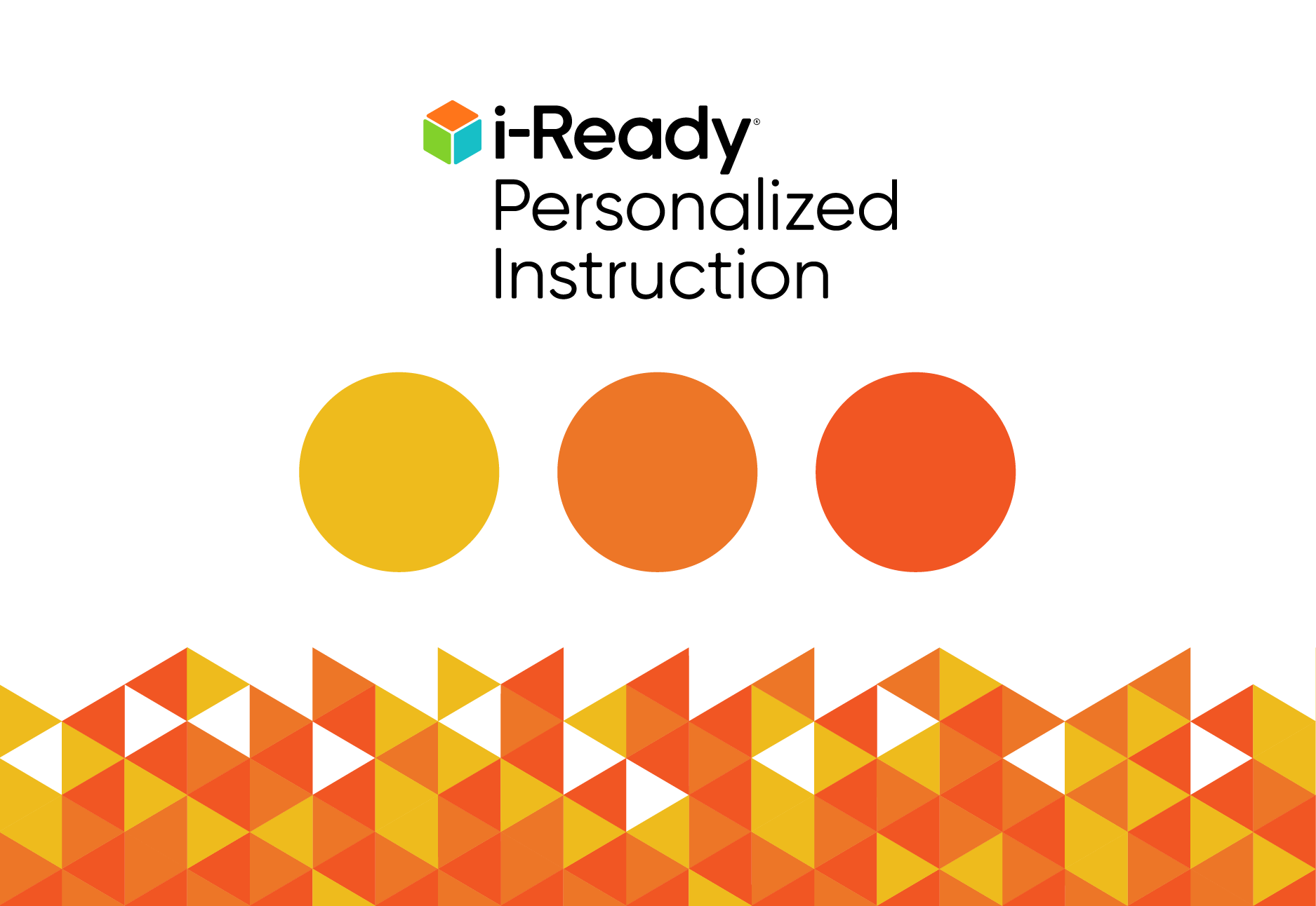
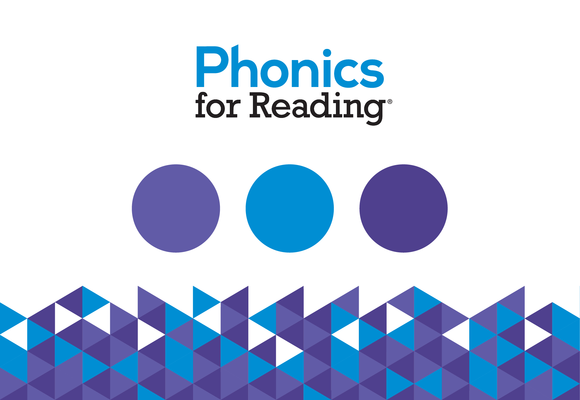
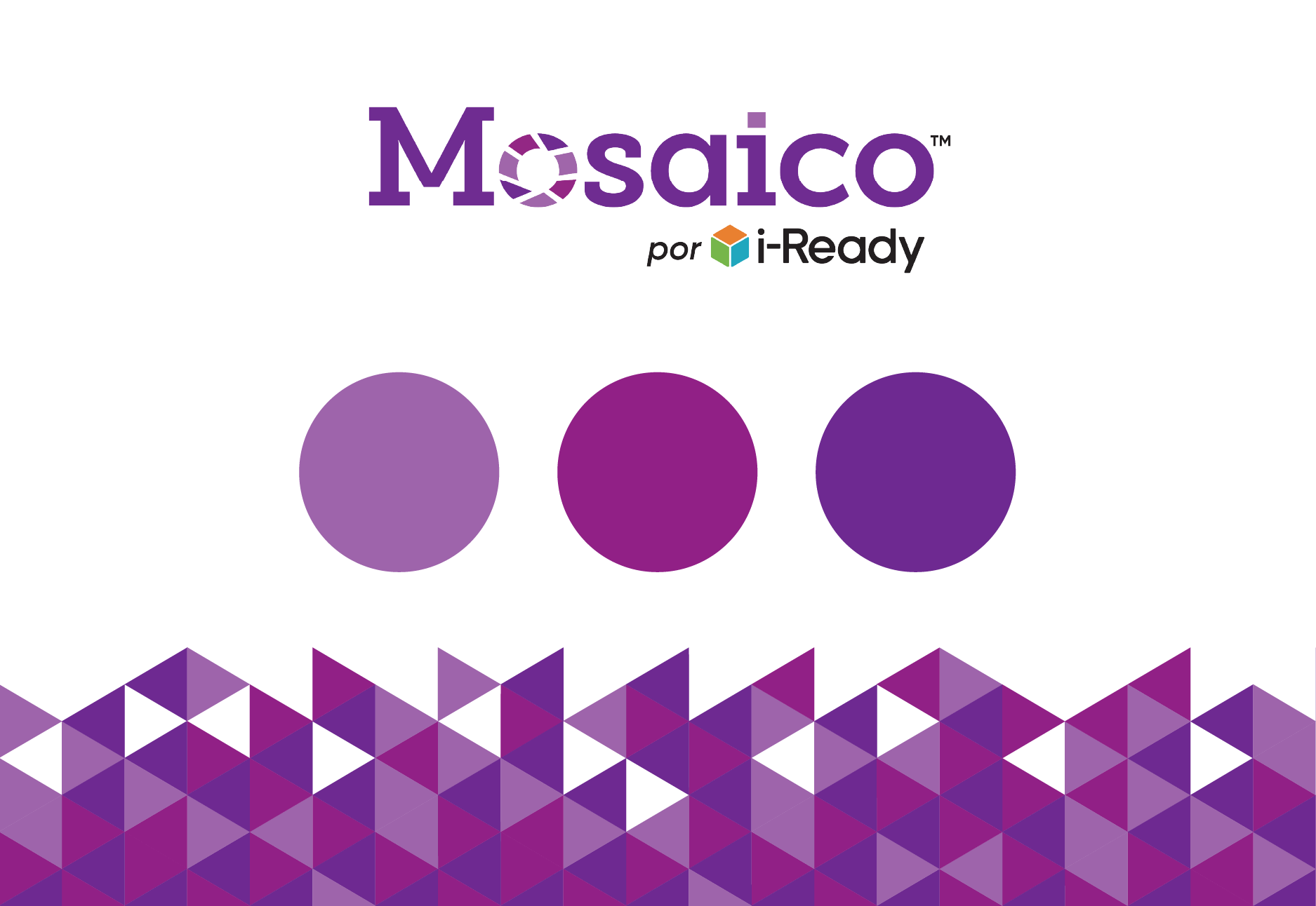
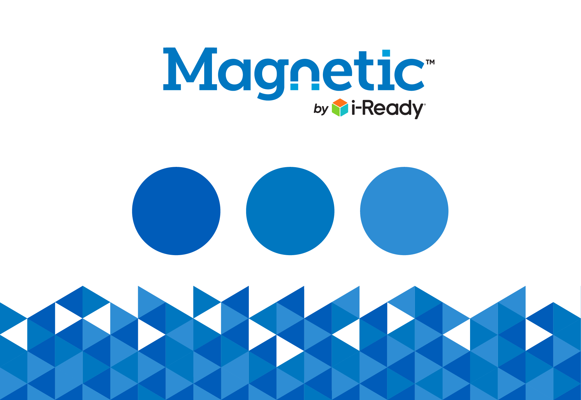
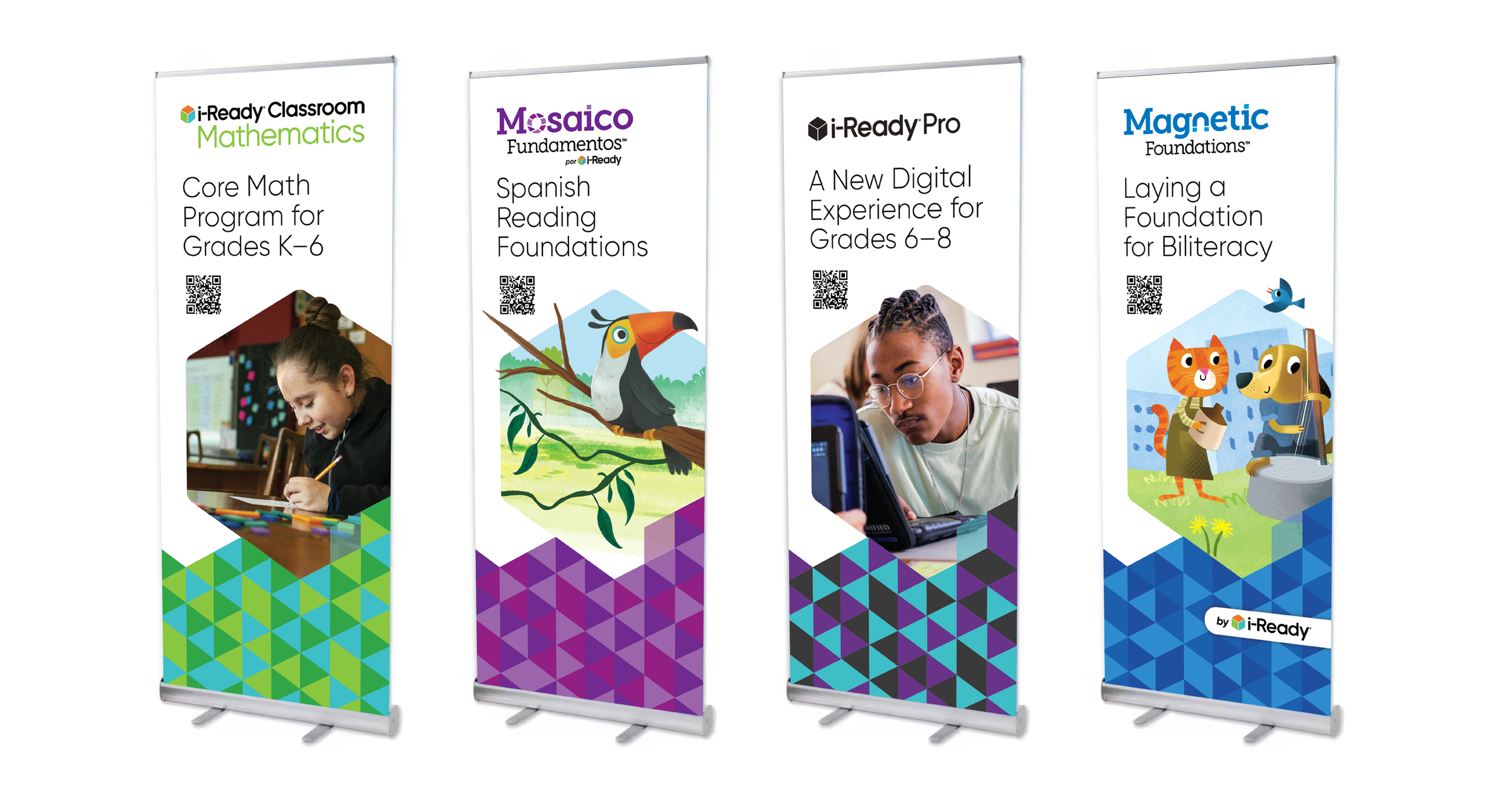
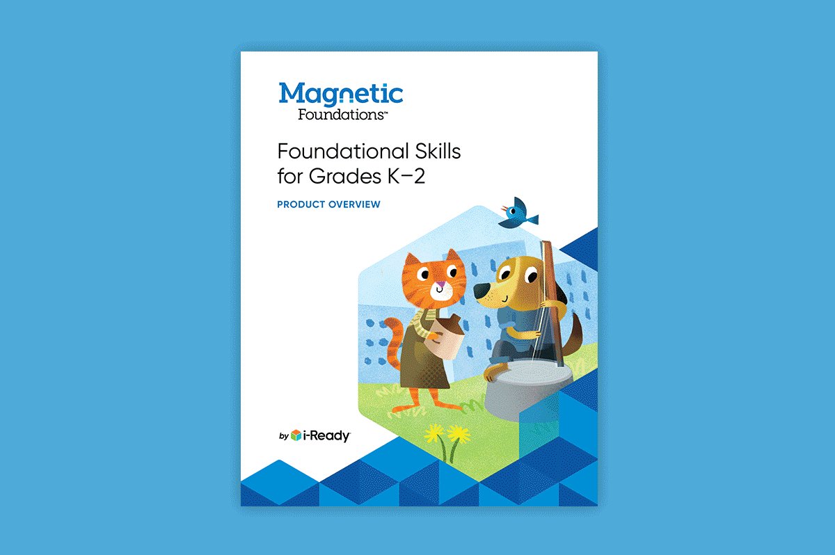
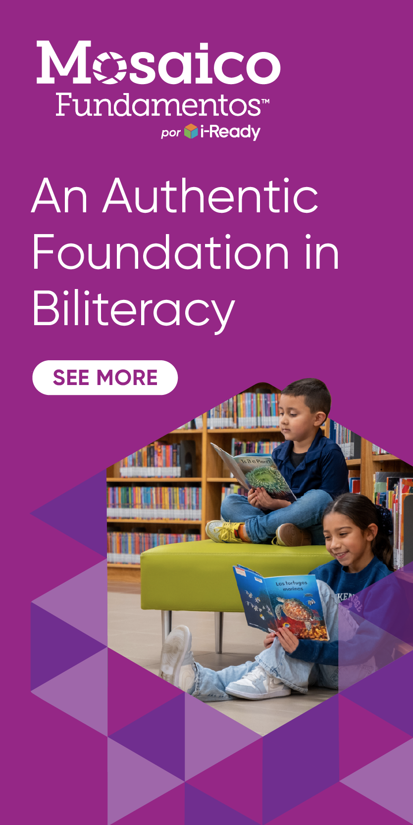
In thinking about the aesthetic as a “system,” we assigned a limited color palette to each of the product sub-brands. This helps visually connect all back to the portfolio-level.
Getting Creative with Equity
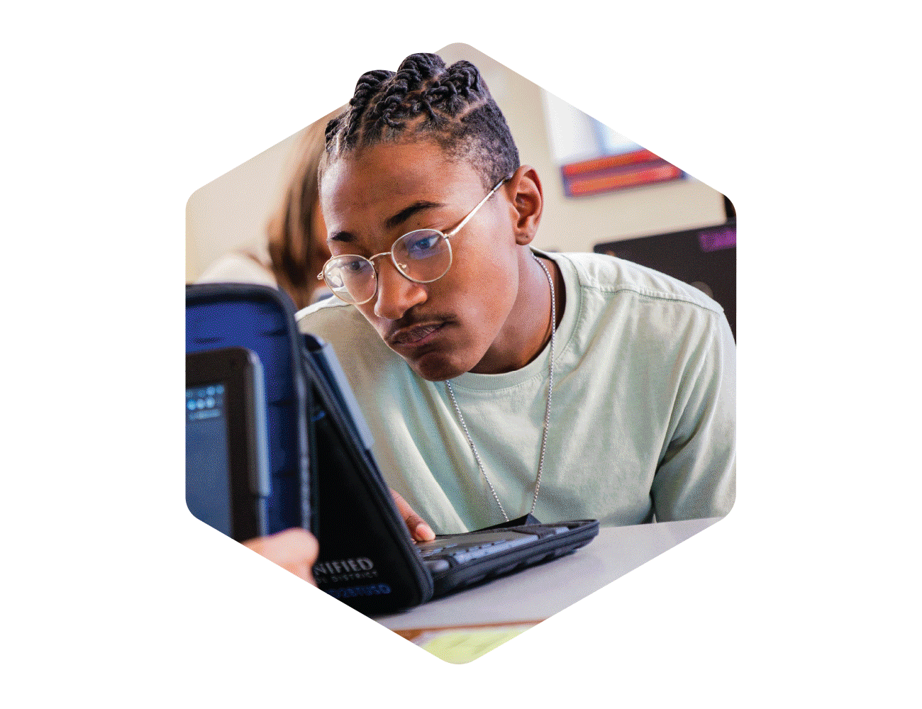
The main photo treatment is a hexagonal container, and, as with everything in the system, is derived from the familiar i-Ready cube.
Cleaning House
Icons were redesigned to be more modern and accessible. Tables and charts were simplified and streamlined.
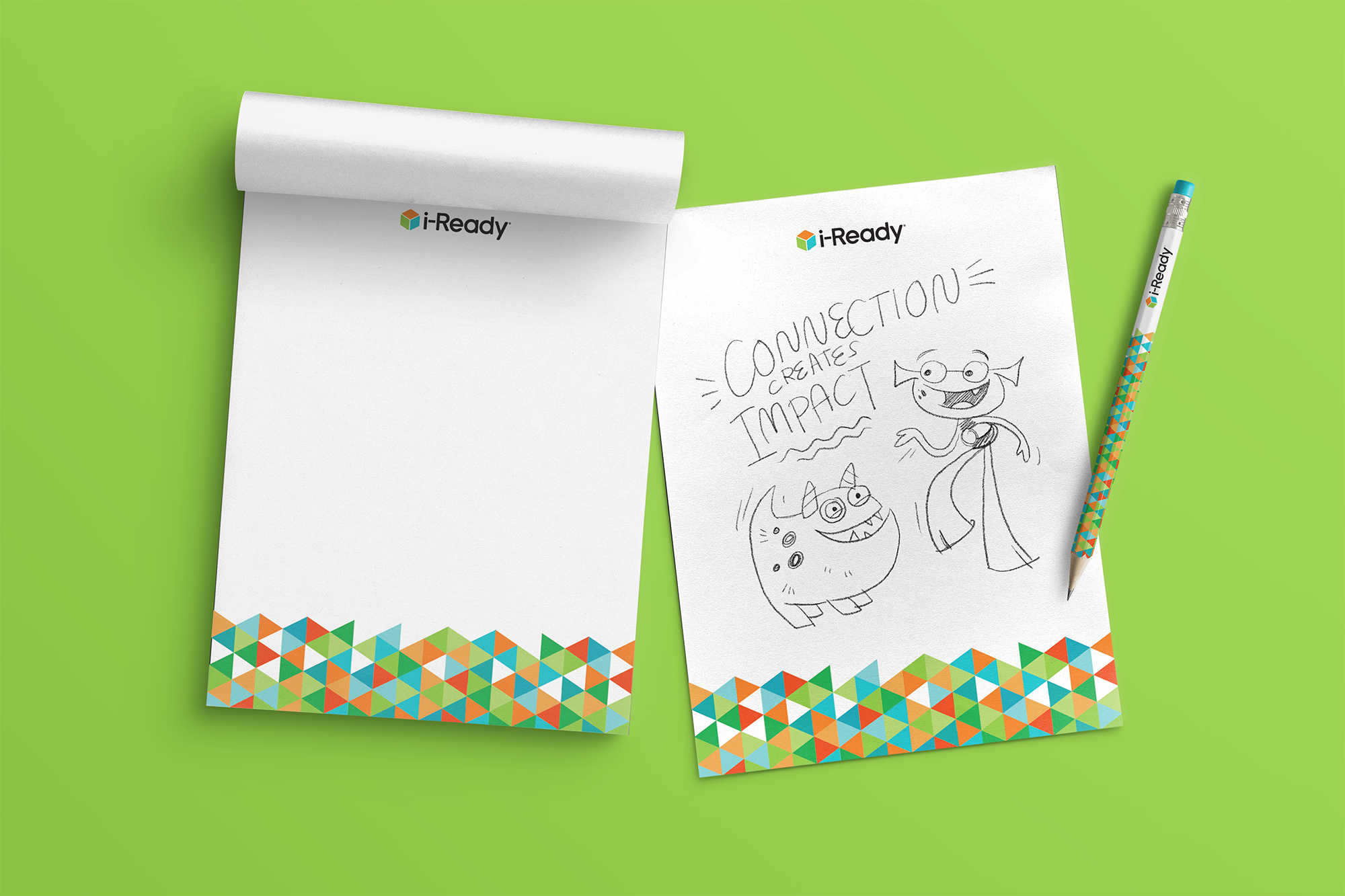
The Power of Play
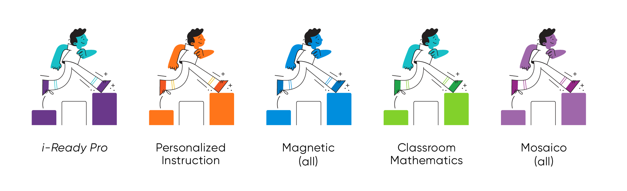
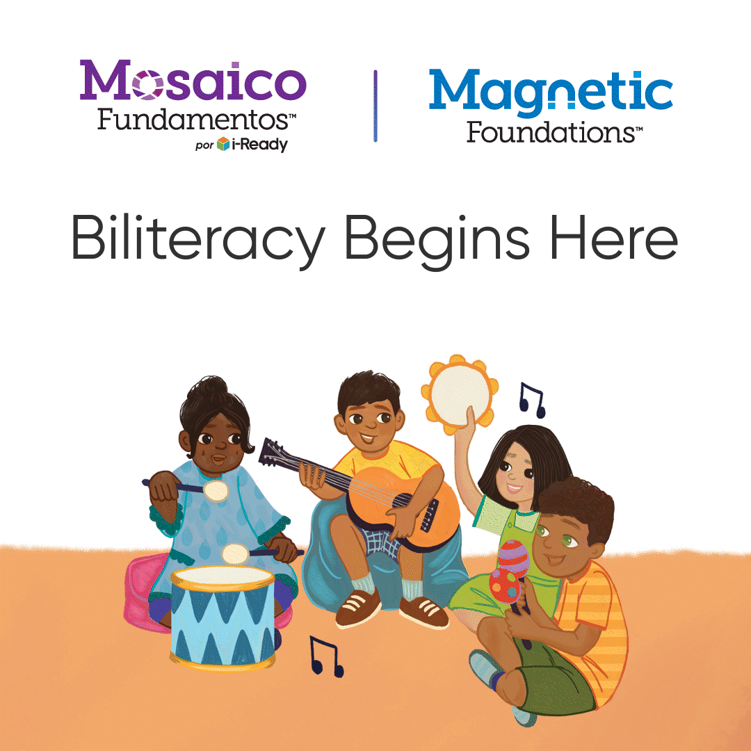
80+ spot illustrations were drawn by yours truly to accompany the new icons and tessellations above, while allowing room for emotion and more complex ideas. The portfolio-level illustrations feature the core trio of i-Ready colors, which also enables the illustrations to flex for the sub-brands simply by updating their colorway.
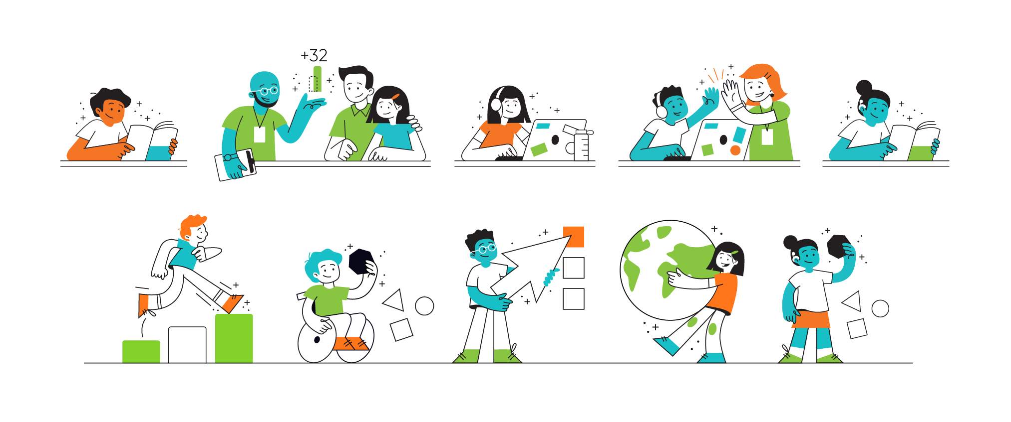
Sub-Brand Illustration Color Ways:
Reuniting with Old Friends
The product team had been using the Gilroy typeface for several years, and the i-Ready logo itself is based off of it (as well as elements of Montserrat). The family is more modern than our existing Jubilat but still approachable, so we decided to incorporate it more fully into marketing materials.
Bringing Product Assets to Life
We invested in adding motion where it counts—social, paid media, and advertising. Our playful, vibrant product illustrations are the perfect candidate for motion, allowing us to breathe life into campaigns.
KPI
Our CTR for these ads averaged 5.5%—an increase of over 350% compared to our company average.
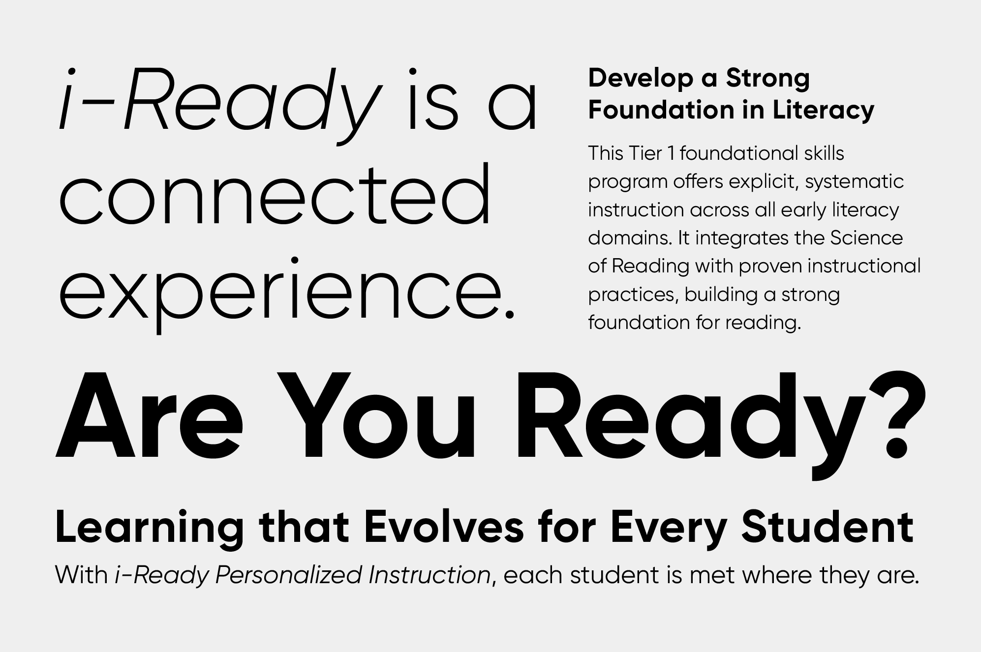
The re-adopted typeface and newly created graphic devices are applied similarly across all products, creating cohesion while allowing the individual sub brands to have their own voice.


While portfolio-level takaways remind the audience that individual sub-brands relate back to the connected experience that is i-Ready.


Our digital touchpoints were also outdated and inconsistent across channels, so we re-approached purpose as well as visuals.
Enhancing the User Experience
The former website was outdated, wordy, and had a disjointed user experience when it came to separating i-Ready from our parent corporate entity. The new experience is distinctly divided in two—most notably in the navigation—focusing on the main audiences for each. The sub-brand design system allows continuity throughout the site while giving space for individual brands to shine.


Socializing & Advertising
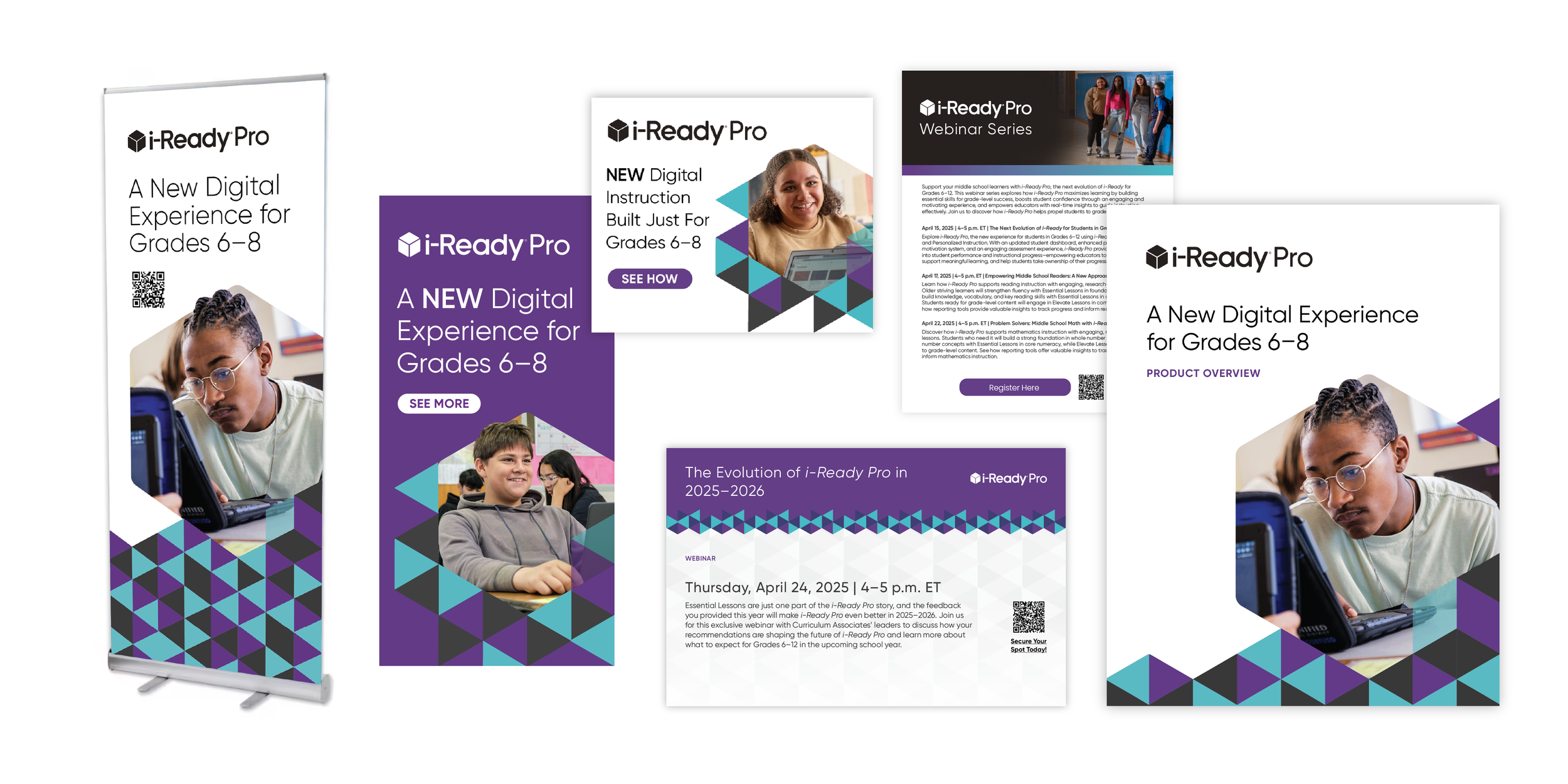
It was important to maintain a distinctive look for the portfolio level as well as for each individual product brand. We commonly have multiple campaigns running at the same time—with the portfolio level emphasizing awareness. We also enforced rules around content, minimizing quantity and focusing on brand-aligned approachable language.
PORTFOLIO-LEVEL (AGNOSTIC)


PRODUCT-LEVEL (SUB-BRAND)


Since the in-person experience is commonly our first touchpoint, we invested in updating our conference experience with a newly branded booth and interactive experience.


Choose-Your-Own Path Interactivity
We designed an informational kiosk with self-serve information for all priority products which included digital versions of brochures and interactive product tours. The kiosk also features information capture and lead gen capabilities.
KPI
During the launch of this new experience at ISTE 2025, lead capture increased by 50%, with the kiosk accounting for 30% of all leads generated at the event.
“This is such a thoughtfully developed body of work…authentic to who we are as a beloved brand with more impact to have for students and teachers.”
— VP Marketing, Curriculum Associates